Streamlining business onboarding at Mamo
A walkthrough how I redesigned Mamo’s sign up and verification flow, breaking down complexity into clarity, transparency, and trust.
Category
Fintech
Duration
1 month
Year
2024
Role
Senior Product Designer
Streamlining business onboarding at Mamo
A walkthrough how I redesigned Mamo’s sign up and verification flow, breaking down complexity into clarity, transparency, and trust.
Category
Fintech
Duration
1 month
Year
2024
Role
Senior Product Designer

A Fintech Promise Meets a Big Challenge
Mamo is a Dubai-based fintech platform designed to help businesses simplify the way they send, receive, and manage money. From payment collection and invoicing to corporate cards and expense tracking, Mamo empowers finance teams to manage everything from a single, modern platform.
But before a business can benefit from Mamo’s ecosystem, it must first complete a detailed sign-up and verification process one required by financial regulators. This stage was becoming a major pain point for new users. What should have been a smooth first impression often felt overwhelming, unclear, and disconnected.
As the Product Designer on the project, I led the redesign of Mamo’s onboarding and verification flow, collaborating closely with the product and engineering teams over a four-week sprint. The goal was to make onboarding feel as effortless and trustworthy as the platform it introduced.
The Goals
The redesign set out to align the onboarding experience with Mamo’s brand promise — simplicity, transparency, and trust. The aim was not just to improve usability but to create a process that felt genuinely human and empowering.
The core objectives were to transform a compliance-heavy flow into one that users could navigate confidently, to make each step clear and actionable, and to help businesses understand what was expected of them from the very start. The process had to meet the strict regulatory standards of the Dubai Financial Services Authority (DFSA) while still maintaining Mamo’s customer-first tone.
Ultimately, the goal was to turn a once-frustrating task into a journey that built momentum — moving users seamlessly from curiosity to activation.
Why Signing Up Wasn't Working
For new businesses, onboarding looked like a maze:
The process was fragmented and lengthy.
Users only discovered required documents halfway through.
Compliance requirements (KYC/KYB) felt intimidating and unclear.
The result? Many users simply gave up.
Listening to the Frustrations
I dug deeper into user pain points and team insights. The story I kept hearing was:
“I just want to know what documents I’ll need before I start.”
“It feels like I’m sending my information into a black hole.”
“I don’t have time to fill this all out in one sitting.”
It was clear: users weren’t against verification they just needed clarity, control, and trust.
Explorations
The exploration began with a question: What would verification look like if it were designed with empathy first?
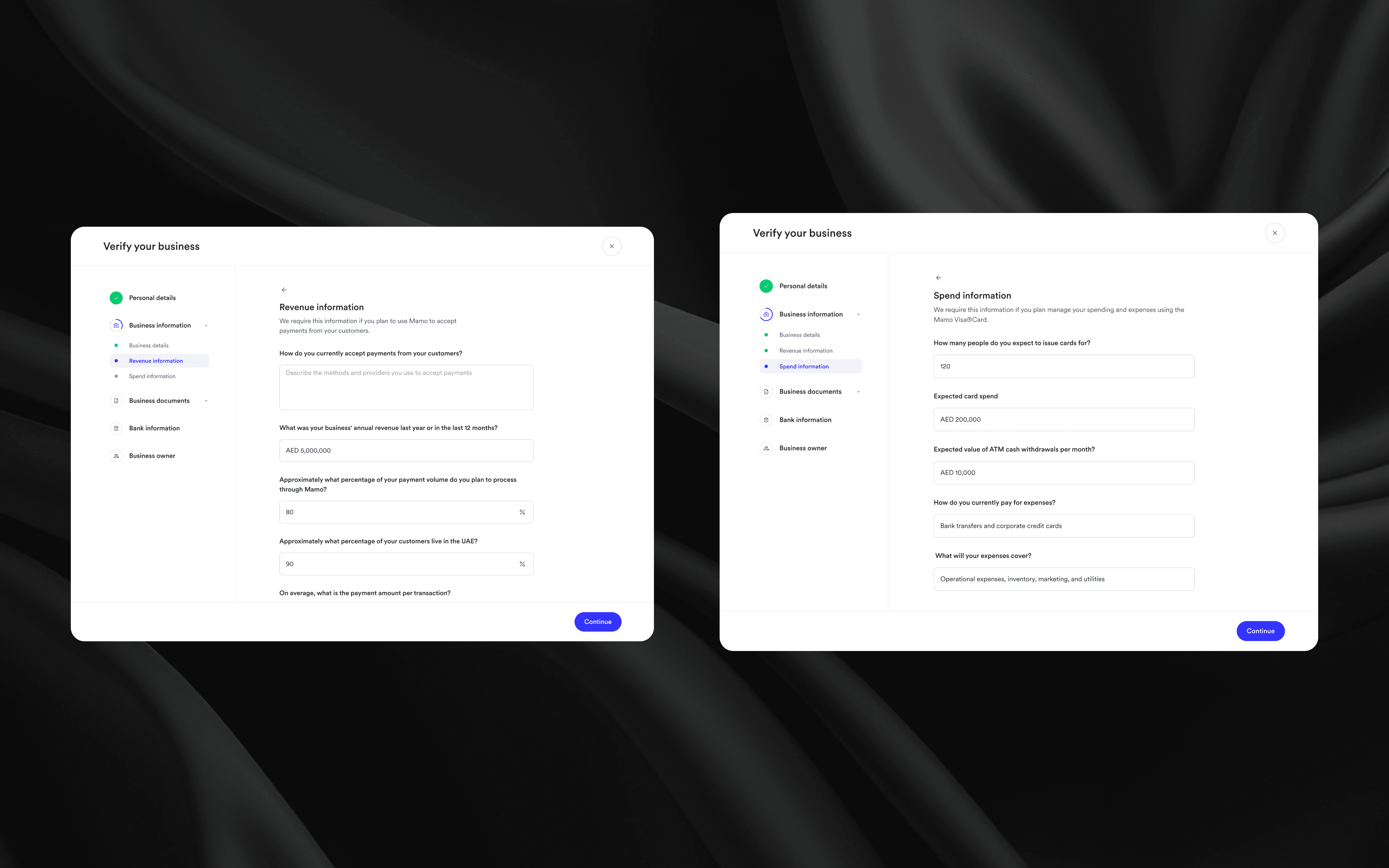
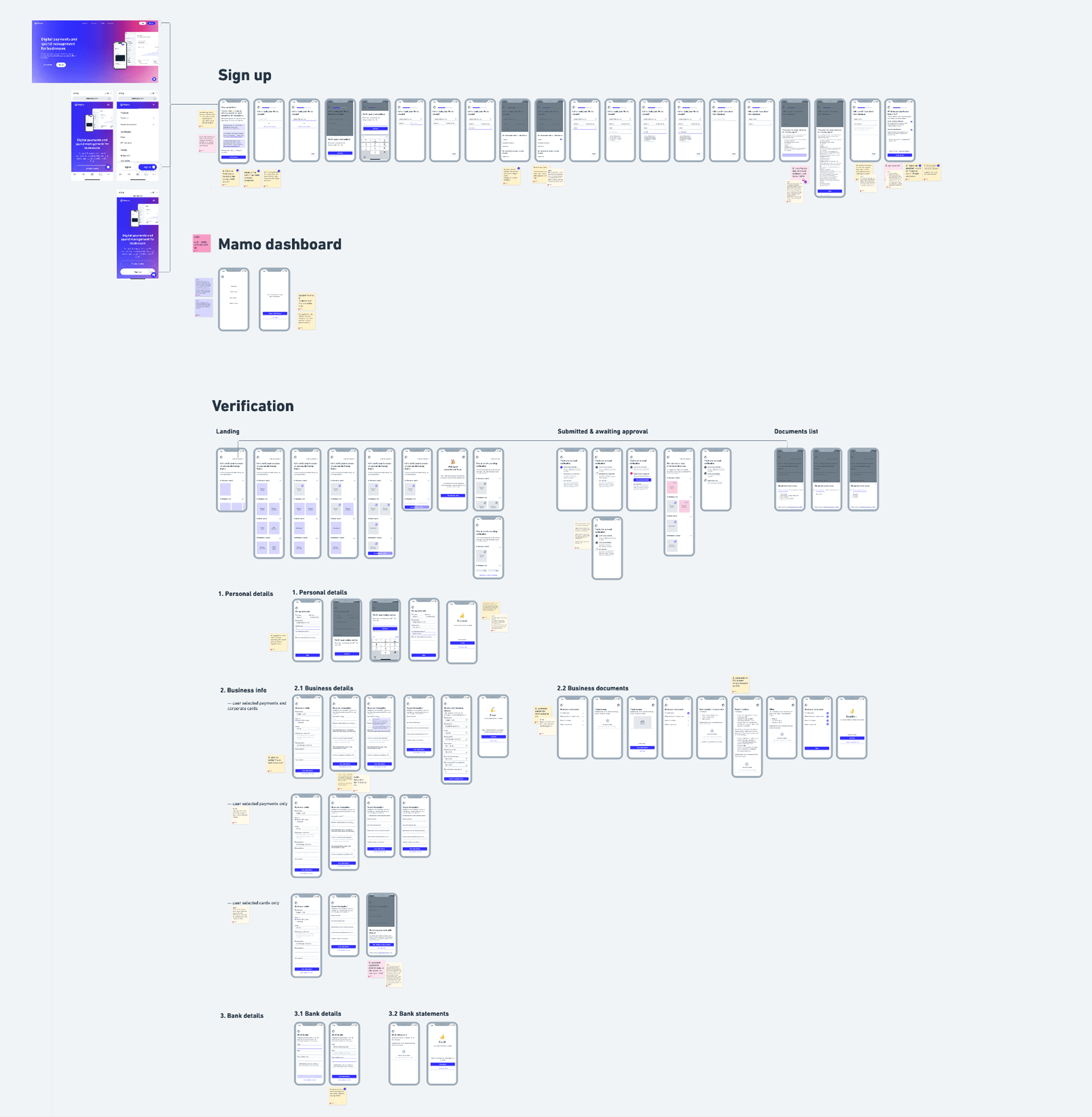
I explored ways to make users feel oriented and in control from the moment they began. The new flow was built around six clear stages from initial sign-up to post-submission tracking each introduced with context, clarity, and visual feedback. Required documents were displayed upfront, ensuring there were no surprises later. Success messages celebrated progress, while options to save and return later offered flexibility to busy professionals.
I introduced a progress tracker to keep users aware of their standing, breaking the process into small, digestible sections. For businesses with different needs whether joining Mamo for payments, cards, or both the flow adapted intelligently, guiding them only through relevant steps.
Every decision was made to reduce cognitive load, ease uncertainty, and build trust. The interface became less of a form to fill and more of a conversation between Mamo and its users.
Visualising The Experience
After refining the structure and logic of the flow in wireframes, I translated everything into high-fidelity designs that aligned with Mamo’s visual system clean, minimal, and confidence-inspiring. The high-fidelity stage was about bringing together clarity, trust, and consistency while maintaining a balance between functionality and brand warmth.
The design was divided into two main stages: Sign Up and Verification each crafted to guide users through a logical and emotionally smooth journey.
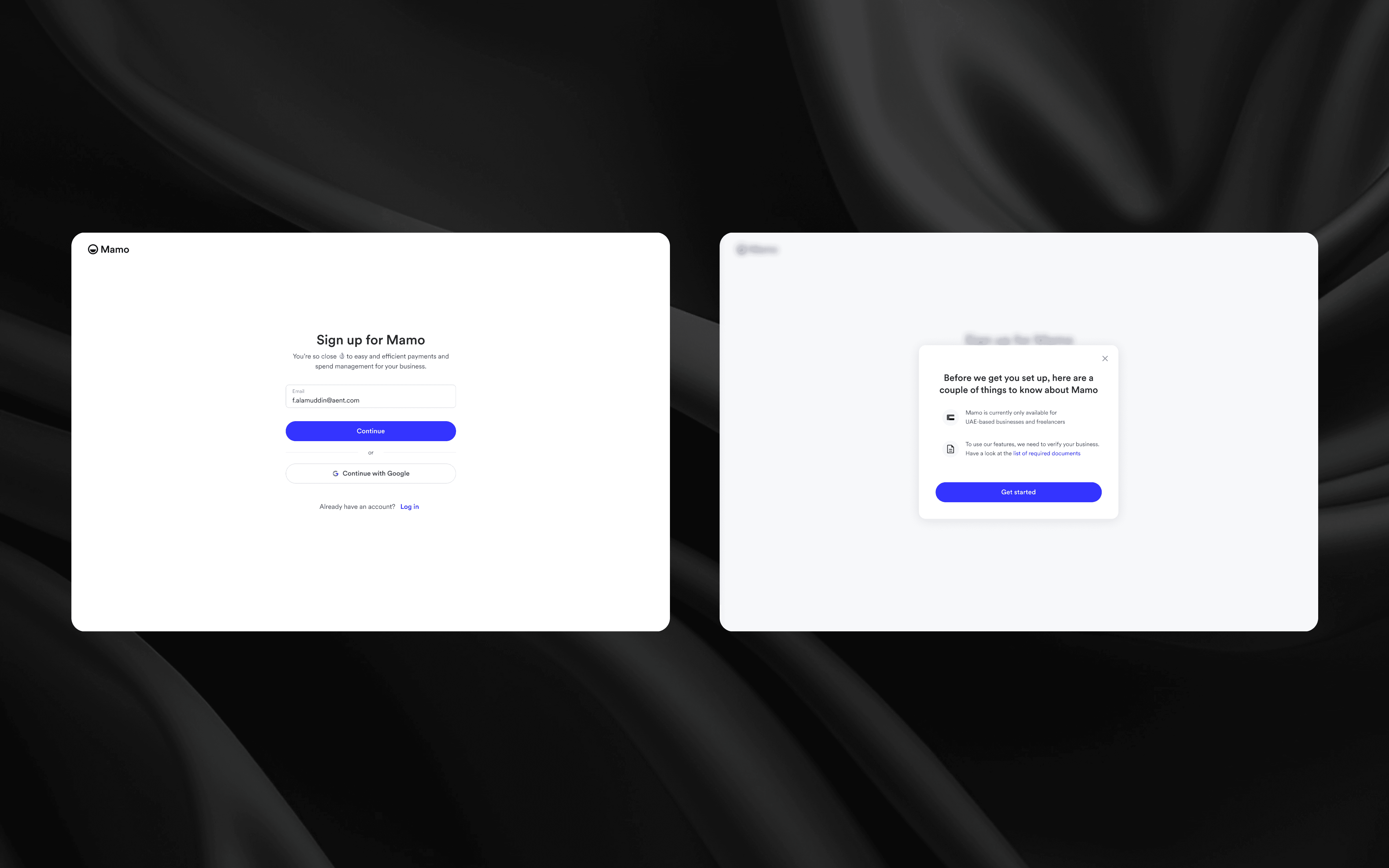
1) Sign Up — Setting the Tone of Trust
The sign-up flow was designed to create the first emotional connection with the user. For many businesses, this was their first interaction with Mamo, so the tone had to be confident, frictionless, and reassuring.
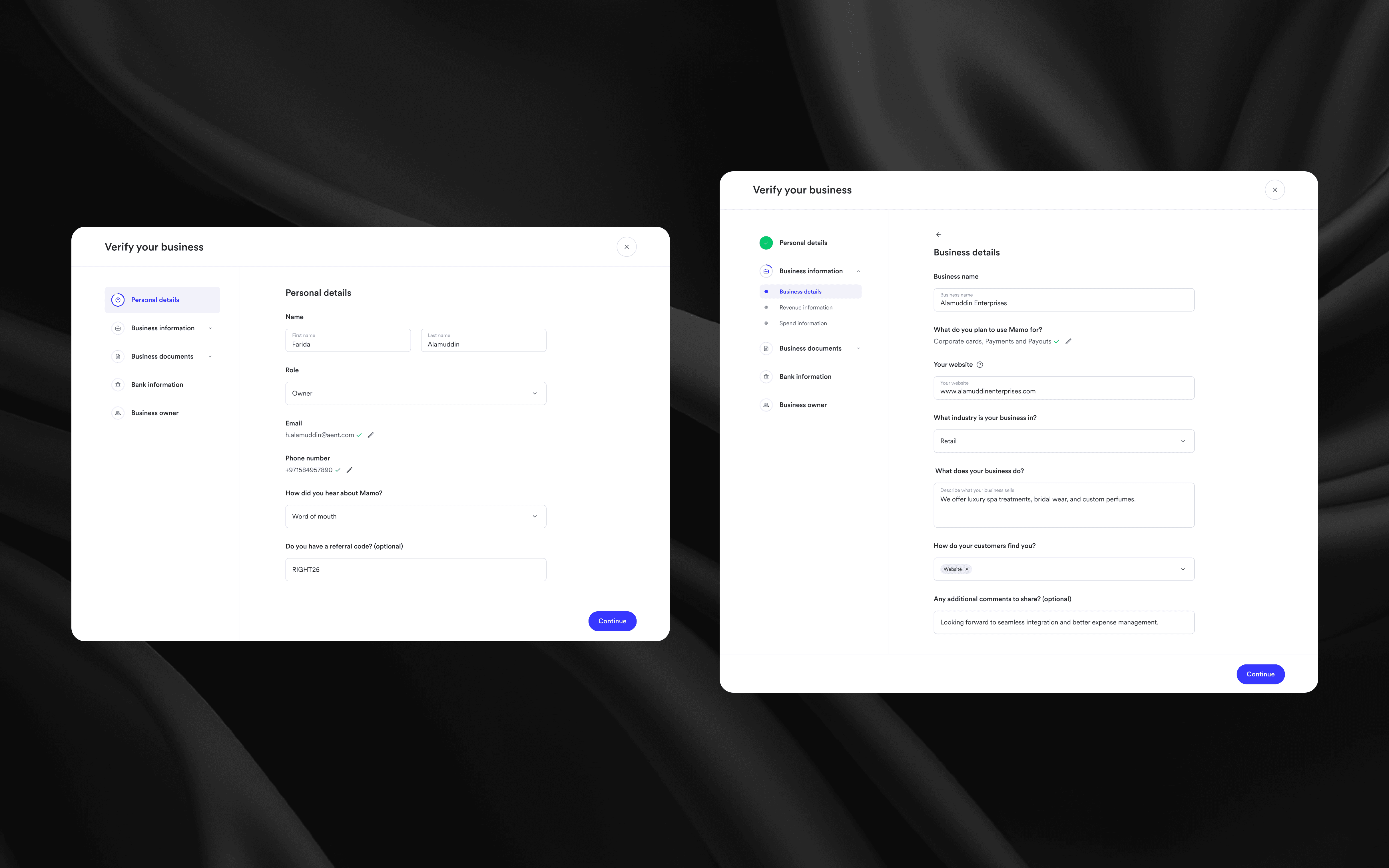
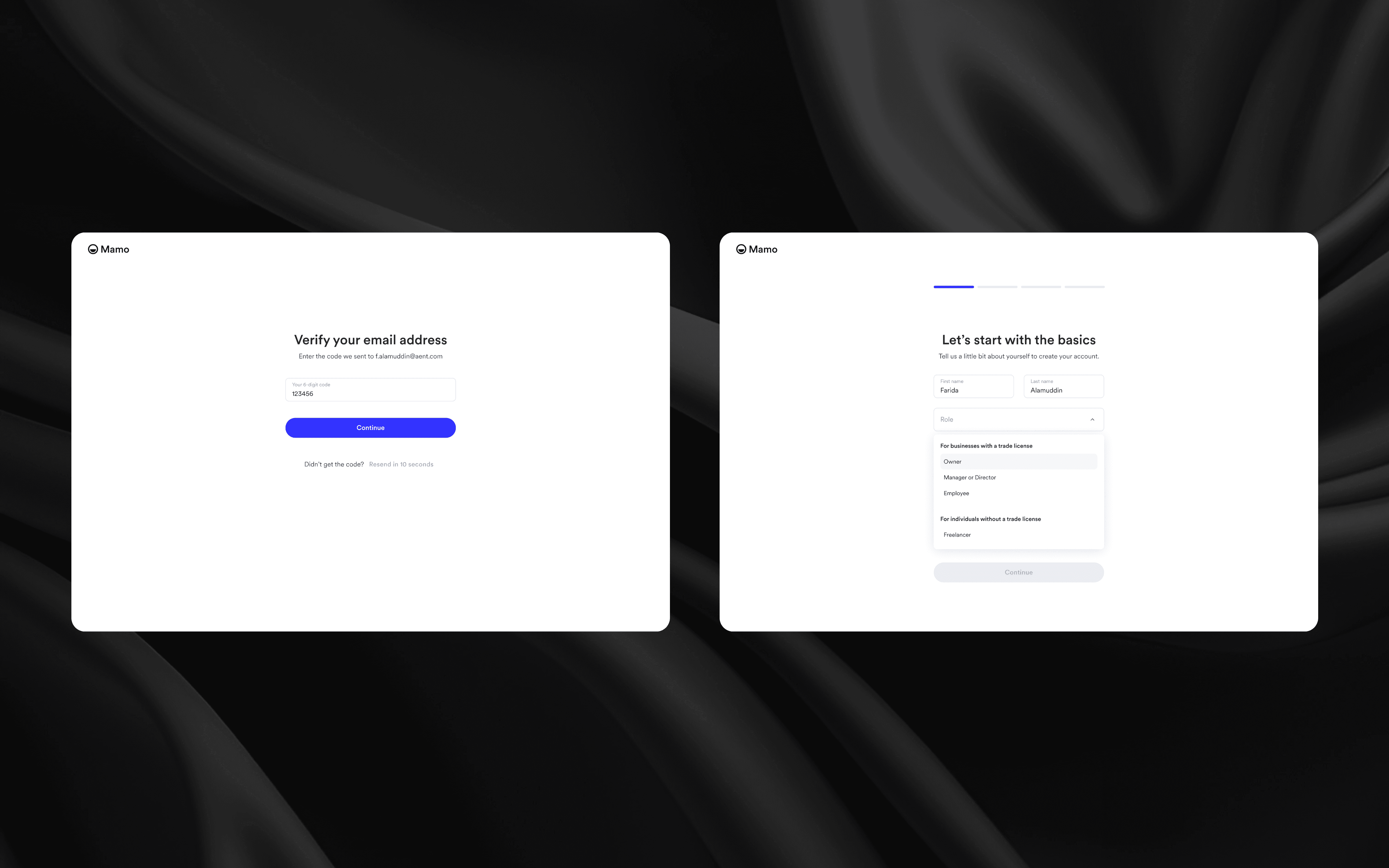
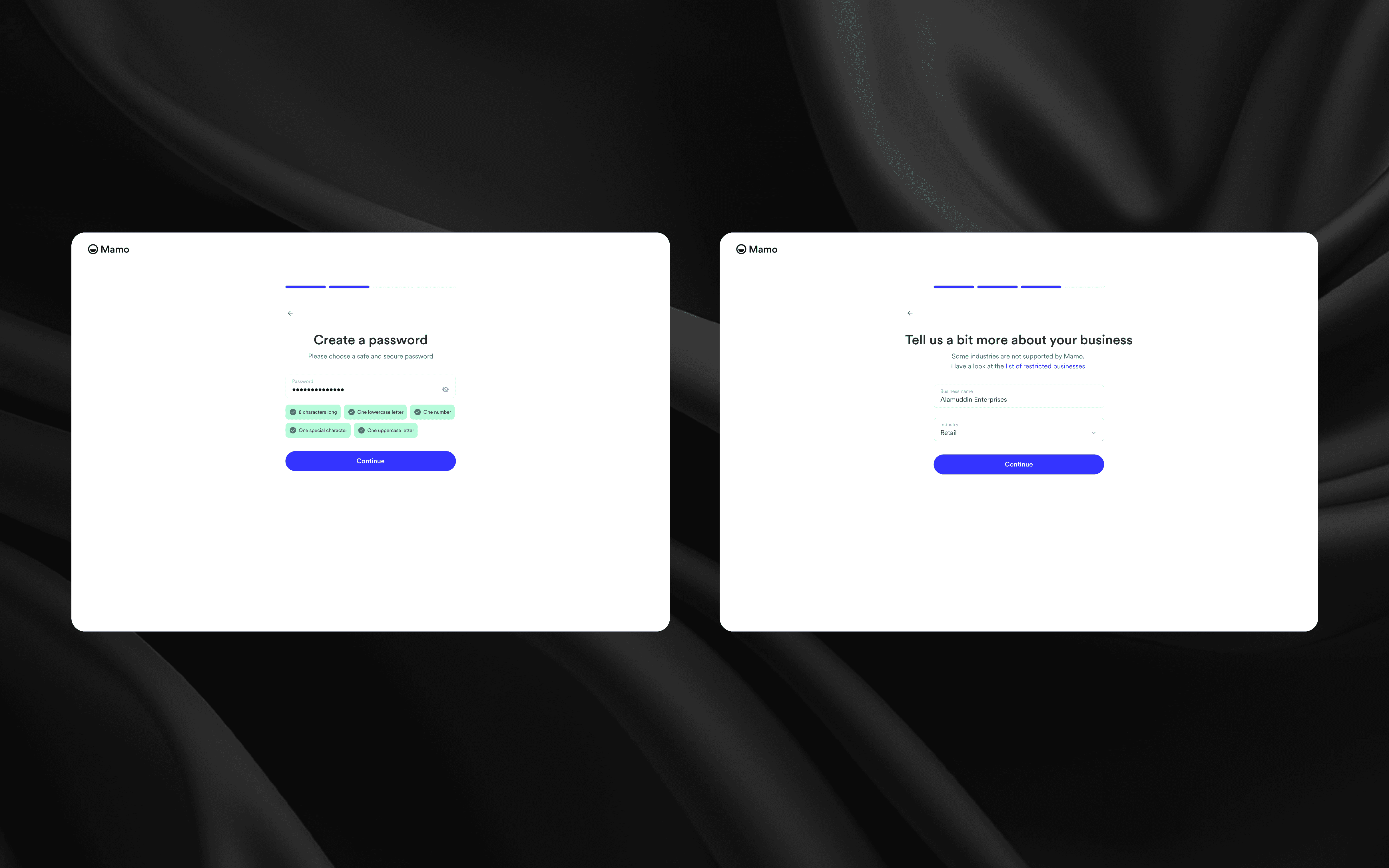
The first step welcomed users with a simple choice: create a Mamo Business account or log in. I stripped away unnecessary input fields, focusing only on essentials name, business email, and password. Each element followed Mamo’s visual language: soft neutral backgrounds, generous spacing, and subtle animations that made the experience feel alive, not transactional.
Once users submitted their basic details, a clear progress indicator appeared to set expectations: they knew upfront how many steps remained before they were ready to start using Mamo.
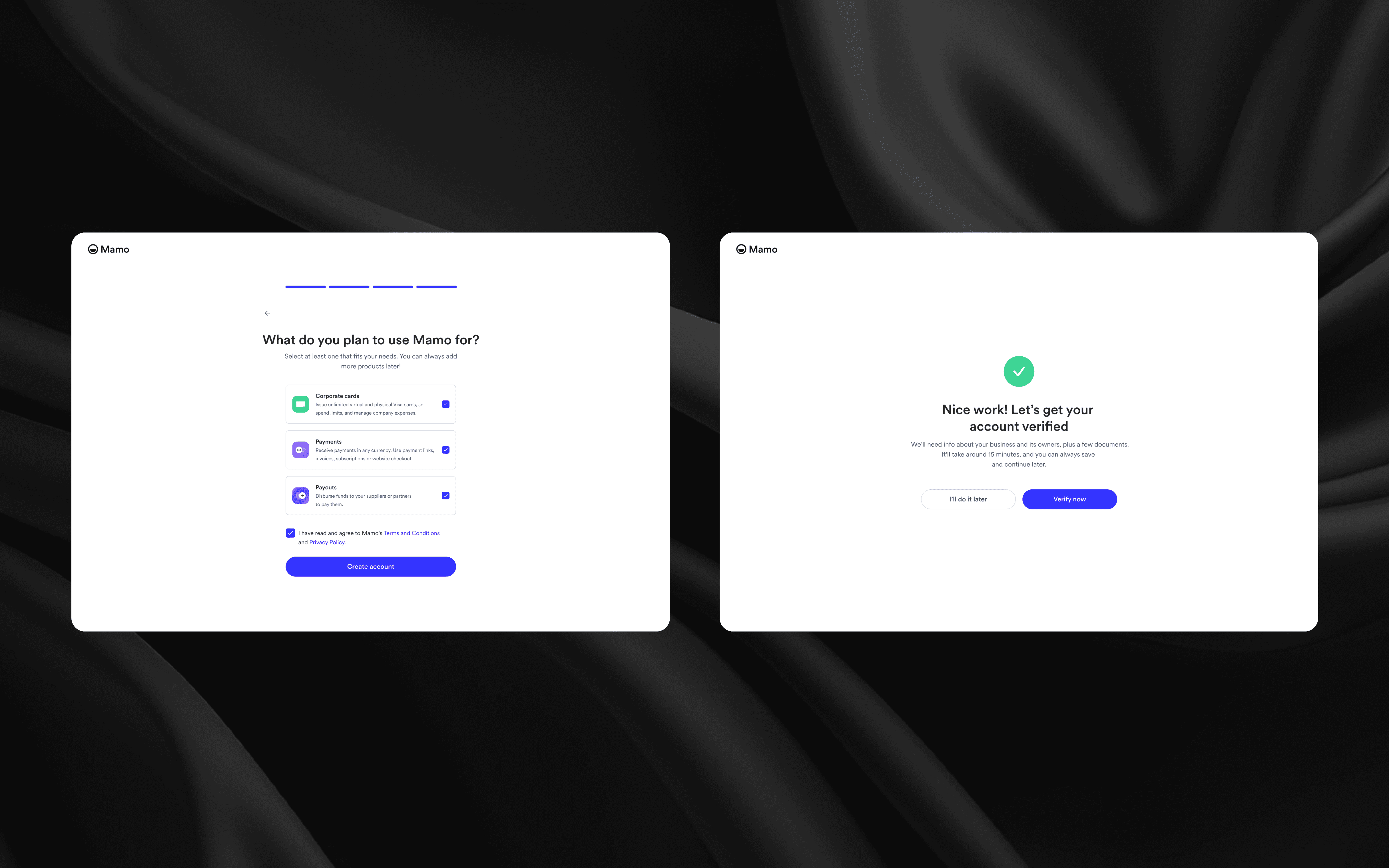
Verification — Making Compliance Feel Effortless
The verification flow was the heart of the project. While essential for Mamo’s DFSA-regulated environment, it had to be designed to feel approachable and manageable for business owners juggling multiple responsibilities.
I broke the process into logical, digestible steps with clear headers and supportive microcopy. Instead of showing users an overwhelming form, each section revealed itself progressively:
1. Personal Details: confirmed the user’s identity, keeping input fields minimal and intuitive.
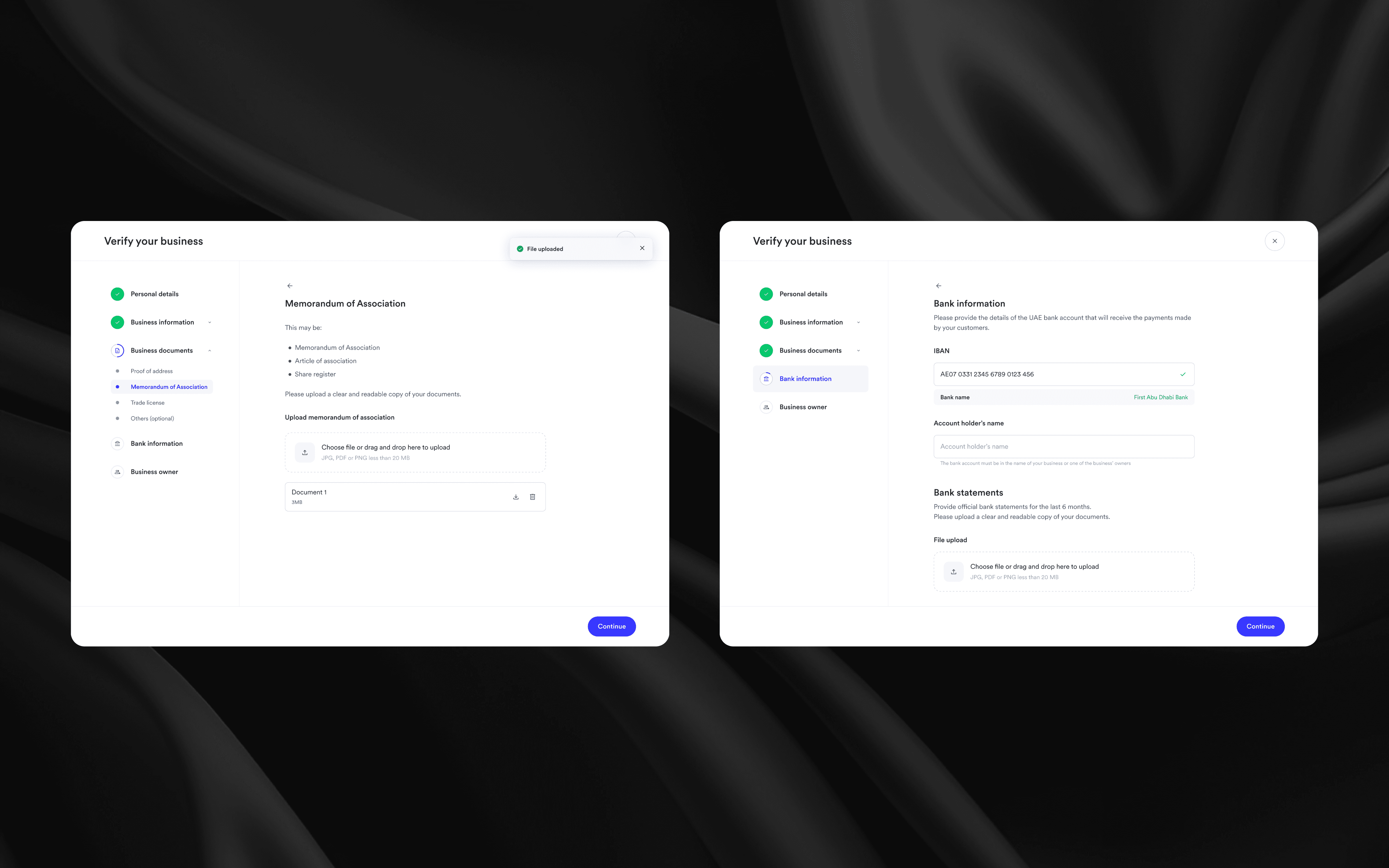
2. Business Information: captured key company data while providing visual document guidelines so users knew exactly what was expected (e.g., trade license, establishment card).
3. Bank Details: included smart recognition that auto-filled the bank name from the IBAN.
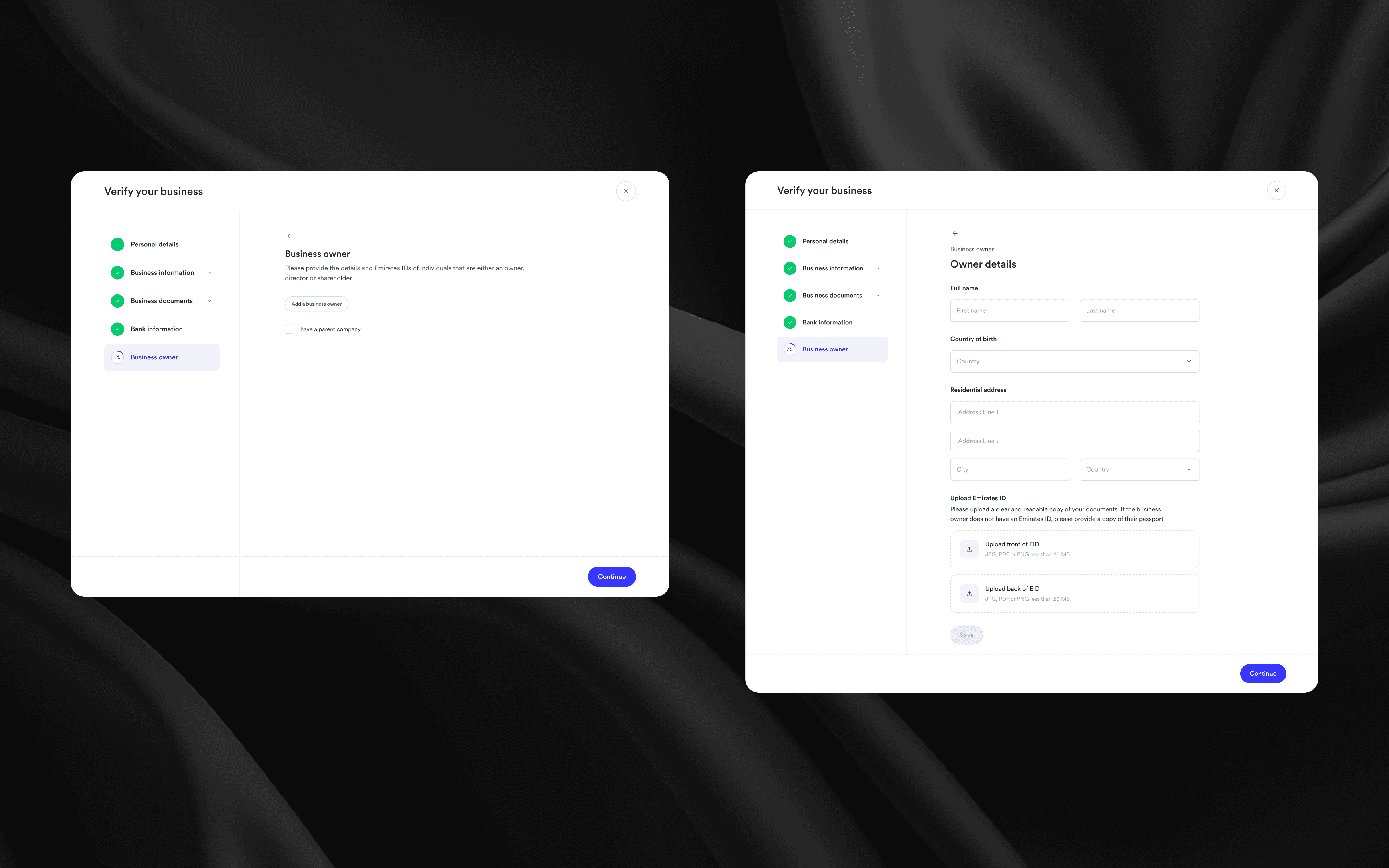
4. Business Owners: adjusted dynamically depending on user role (Owner, Manager, Employee), showing only relevant fields.
5. Document Upload: allowed for multiple formats (PDF, JPG, PNG), with a clean drag-and-drop interface and clear success indicators.
6. Submission & Tracking: the final stage displayed a confirmation state with ongoing status visibility, reinforcing transparency.