Seamless, secure instant payments with PayTo
Seamless, secure instant payments with PayTo
To secure Backbase’s first Australian client, we needed to integrate PayTo the country’s new instant payment method into our retail banking app while maintaining strict compliance and a frictionless user experience.
Category
Fintech
Duration
3 weeks
Year
2022
Role
Product Designer

Bringing PayTo to Backbase
Designing a payment experience for Australia's banking customers
When Backbase entered the Australian market, one question came up almost immediately:
"Can your platform support PayTo?"
PayTo is a widely used, real-time payment method in Australia. For local banks, it's not a "nice to have," it's expected. This case study tells the story of how I helped design and integrate PayTo into Backbase's mobile banking product in a way that felt seamless, secure, and familiar to users.
The problem
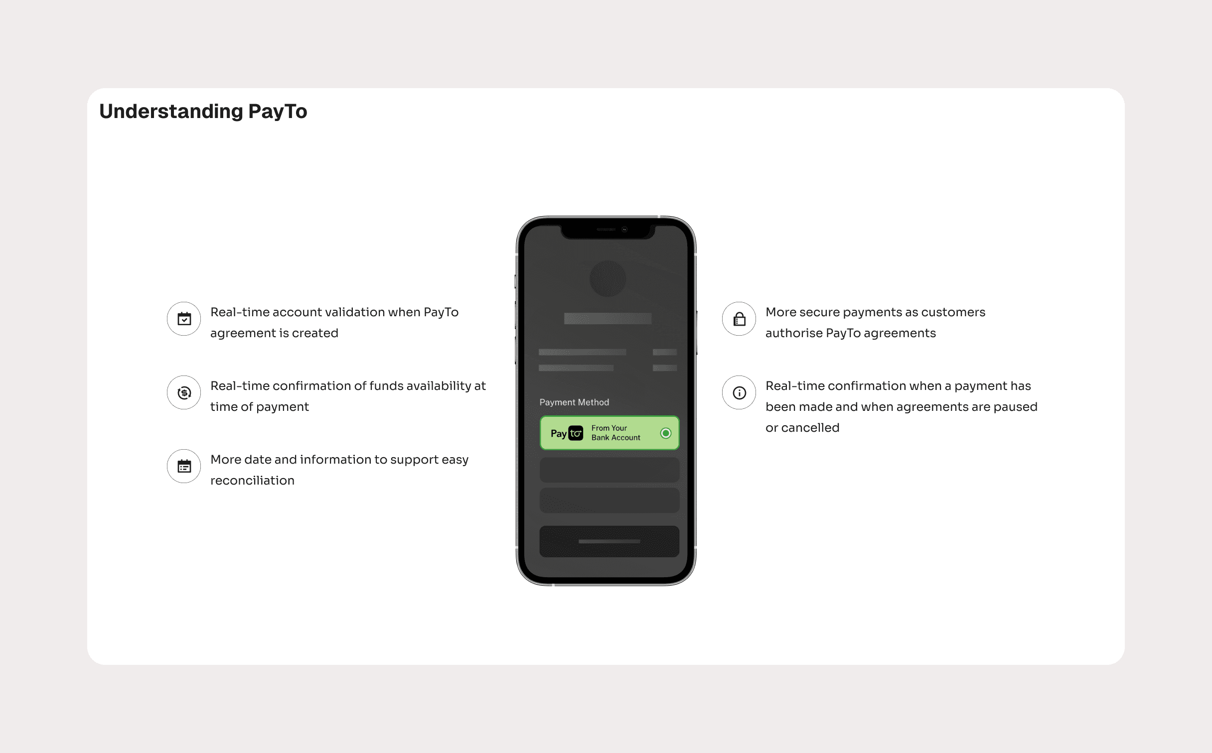
Backbase already had a robust mobile banking experience, but PayTo introduced new complexity.
Users needed to:
Authorize recurring and one-off payments
Understand exactly what they were agreeing to
Feel confident they could pause, modify, or cancel payments at any time
The feature had to fit naturally into the existing product—no new mental models, no learning curve, no visual inconsistencies.
On the business side, getting this right was critical. A successful PayTo implementation would help Backbase secure its first Australian enterprise client.
My role
I worked as the Product Designer (UX/UI) on this project, collaborating closely with a product manager, a mobile engineer, and a solution engineer.
My responsibilities covered the full design process:
Research and insight synthesis
User flows and interaction design
Wireframes and high-fidelity UI
Prototyping and usability testing
Applying and extending the Backbase Design System
How I approached it
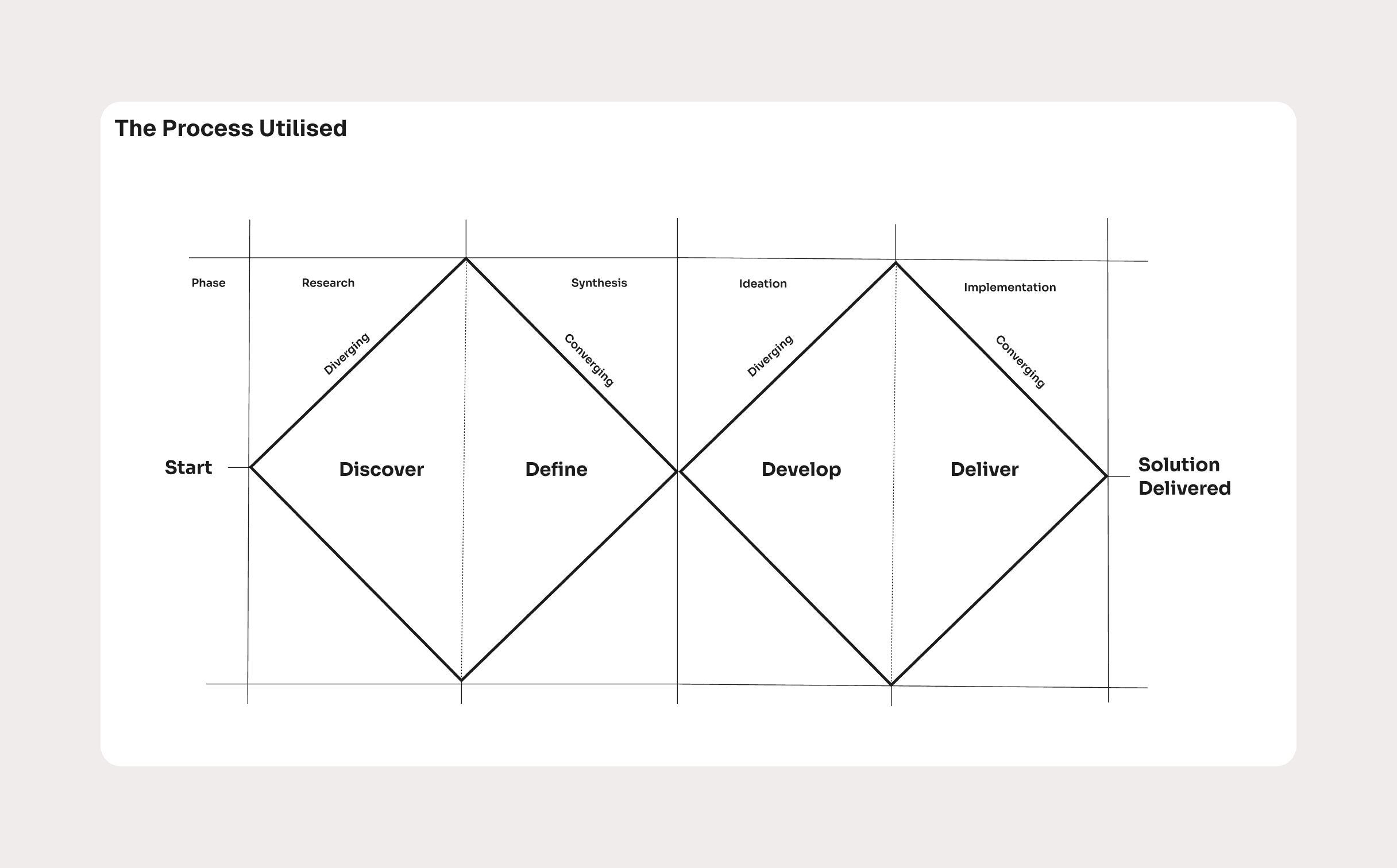
I followed a Double Diamond approach—starting wide to understand the problem space, then narrowing in on the most effective solution.
Before designing anything, I spent time understanding:
How PayTo works in the real world
What users expect from modern payment experiences
Where confusion or mistrust typically shows up in financial products
This ensured we weren't just adding a feature, but designing something people would actually feel comfortable using.
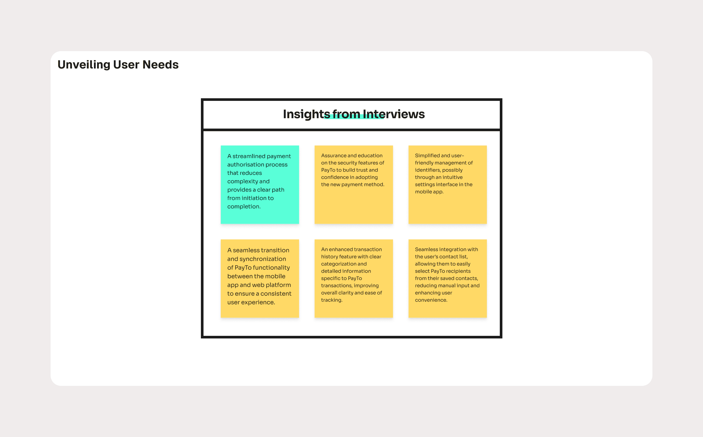
What users told us
Through interviews, surveys, and usability testing, a few clear needs emerged:
"I want to know exactly what I'm authorizing."
"I need to see the status of my payments at a glance."
"If something changes, I want to fix it quickly."
"Don't make me re-learn how the app works."
Users weren't asking for flashy features—they wanted clarity, control, and reassurance.
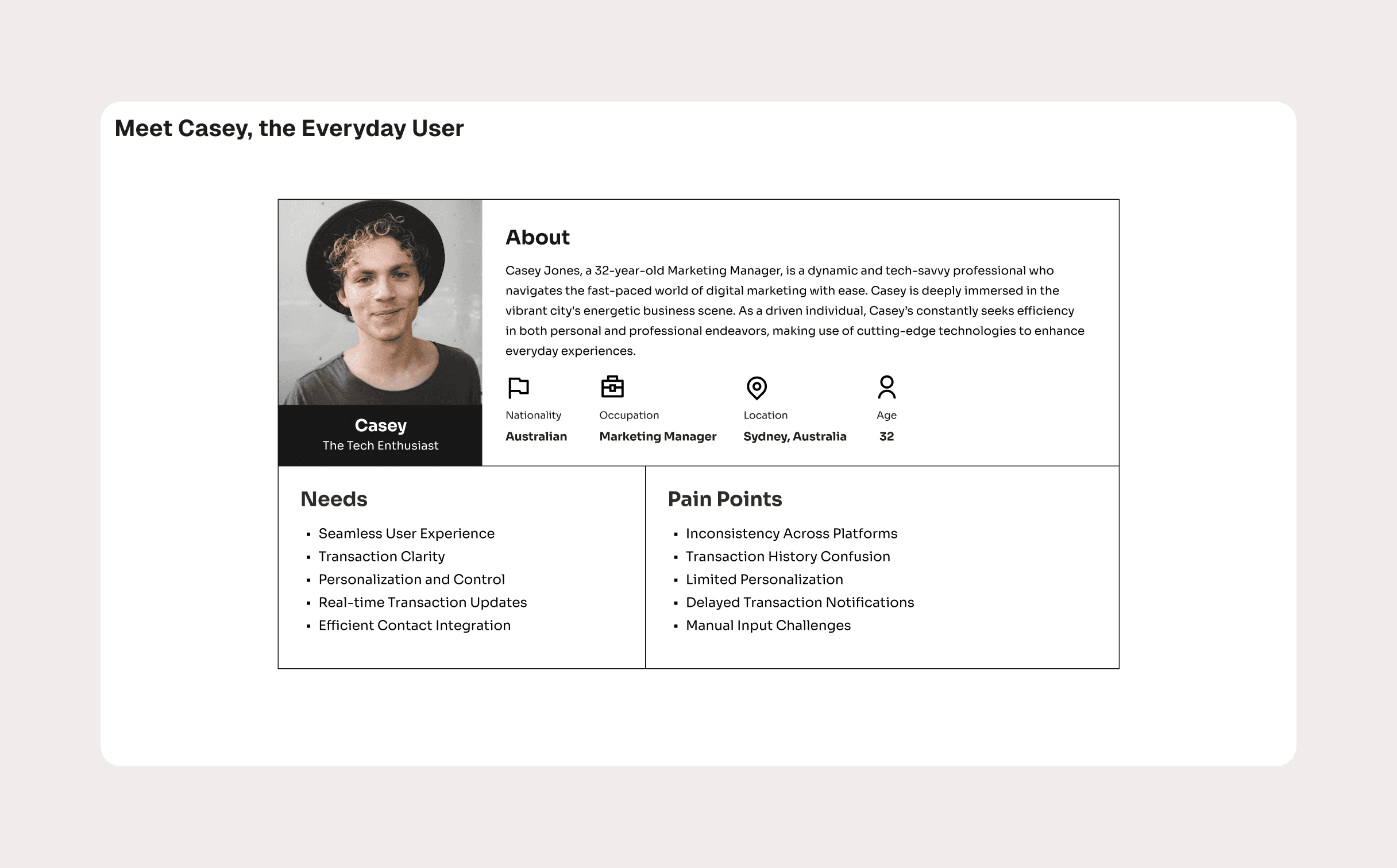
Meet Casey
To keep decisions grounded, I created a primary persona: Casey.
Casey is a 32-year-old marketing manager based in Sydney. She's tech-savvy, busy, and values efficiency. She manages bills, subscriptions, and transfers through her banking app and expects things to "just work."
Her biggest frustrations?
Confusing transaction histories
Delayed or unclear notifications
Too much manual input
Inconsistent experiences across platforms
Casey became the reference point for every design decision.
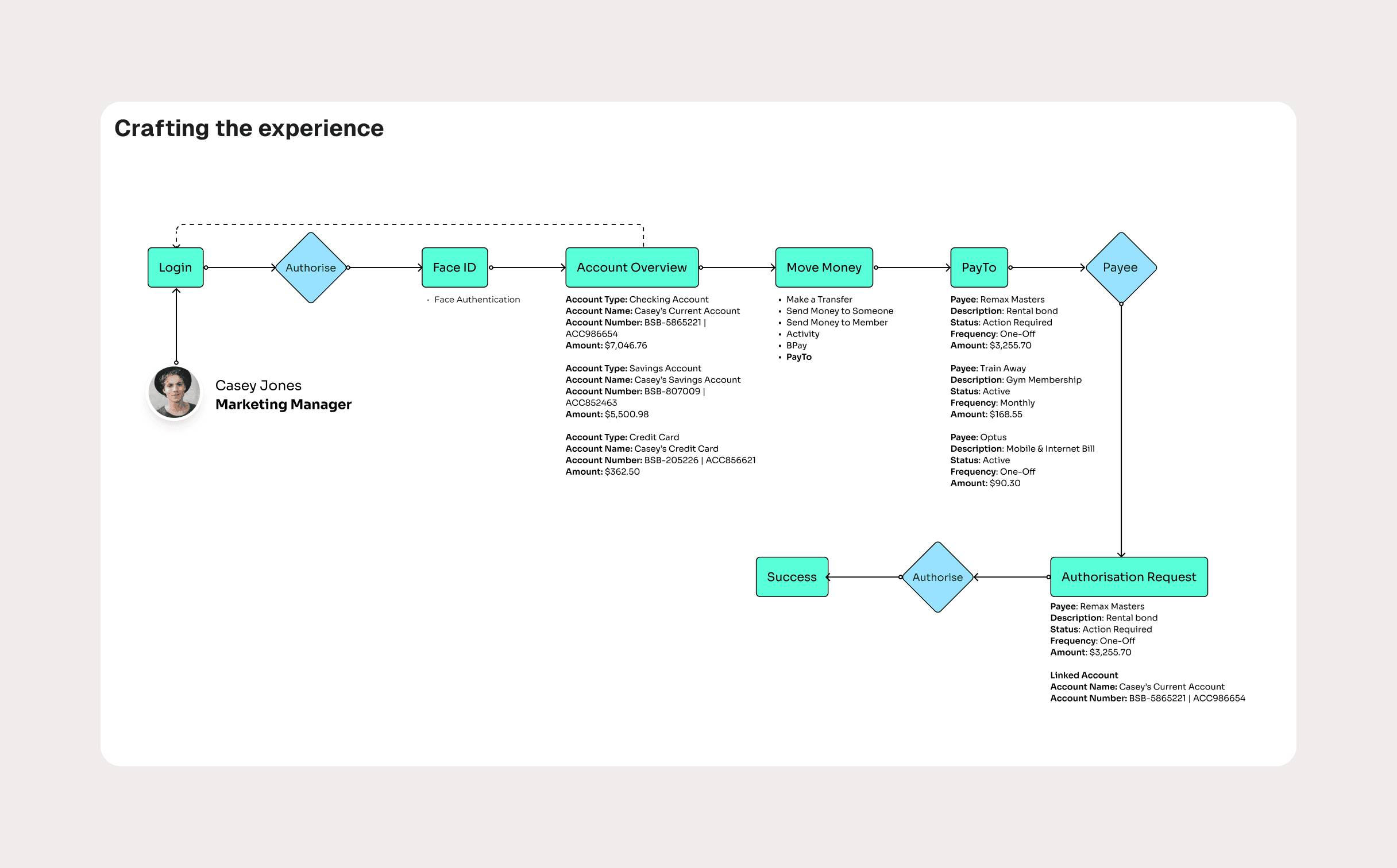
Designing the experience
One of the most important decisions was where PayTo lives in the app.
Instead of introducing it as something new or separate, I placed PayTo within the existing "Move Money" section. This aligned with users' mental models and reduced friction.
From there, I focused on:
Clear end-to-end flows for authorizing payments
Strong visual cues for payment status and urgency
Confirmation steps to prevent costly mistakes
Simple language that explains what's happening and why
Every screen was designed to answer one core question:
"What's going on, and what do I need to do next?"
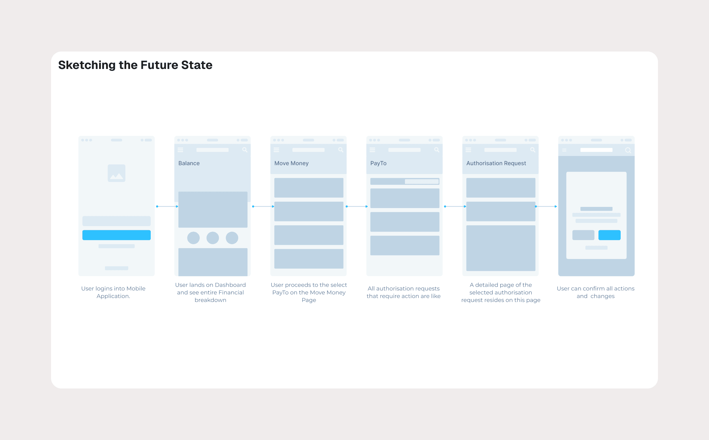
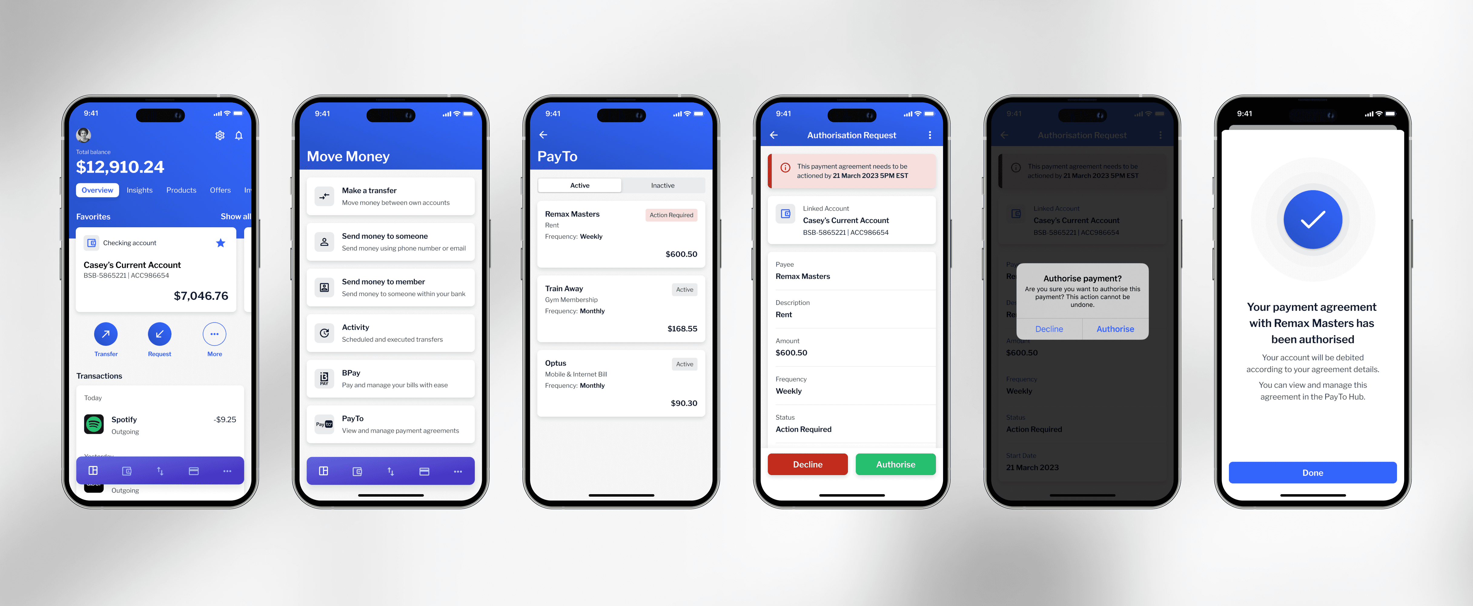
Bringing it to life
Using the Backbase Design System, I translated validated concepts into high-fidelity designs and interactive prototypes.
The design system maintained consistency across mobile and web while allowing flexibility to support PayTo-specific needs like:
Status indicators for agreements
Action-required states
Success and confirmation feedback
We tested the prototypes with client stakeholders and iterated based on feedback, particularly around discoverability and edge cases.
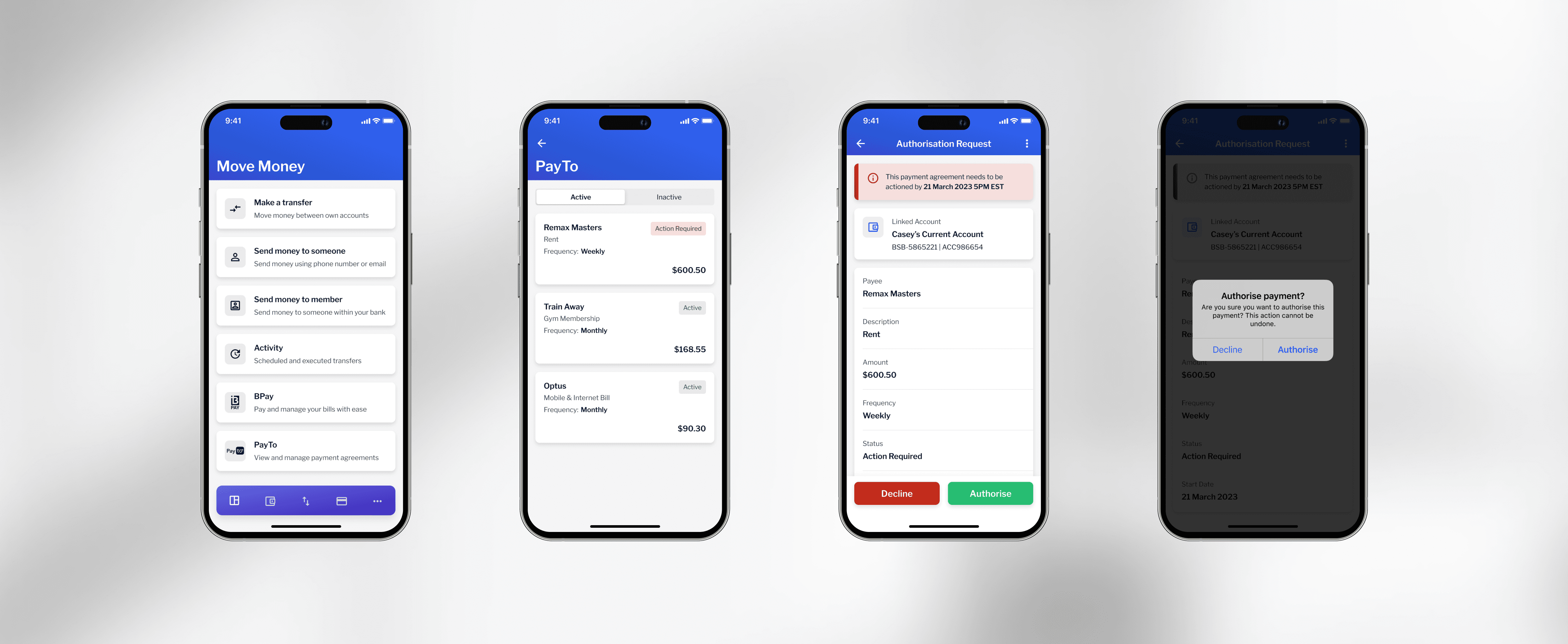
Refinement and edge cases
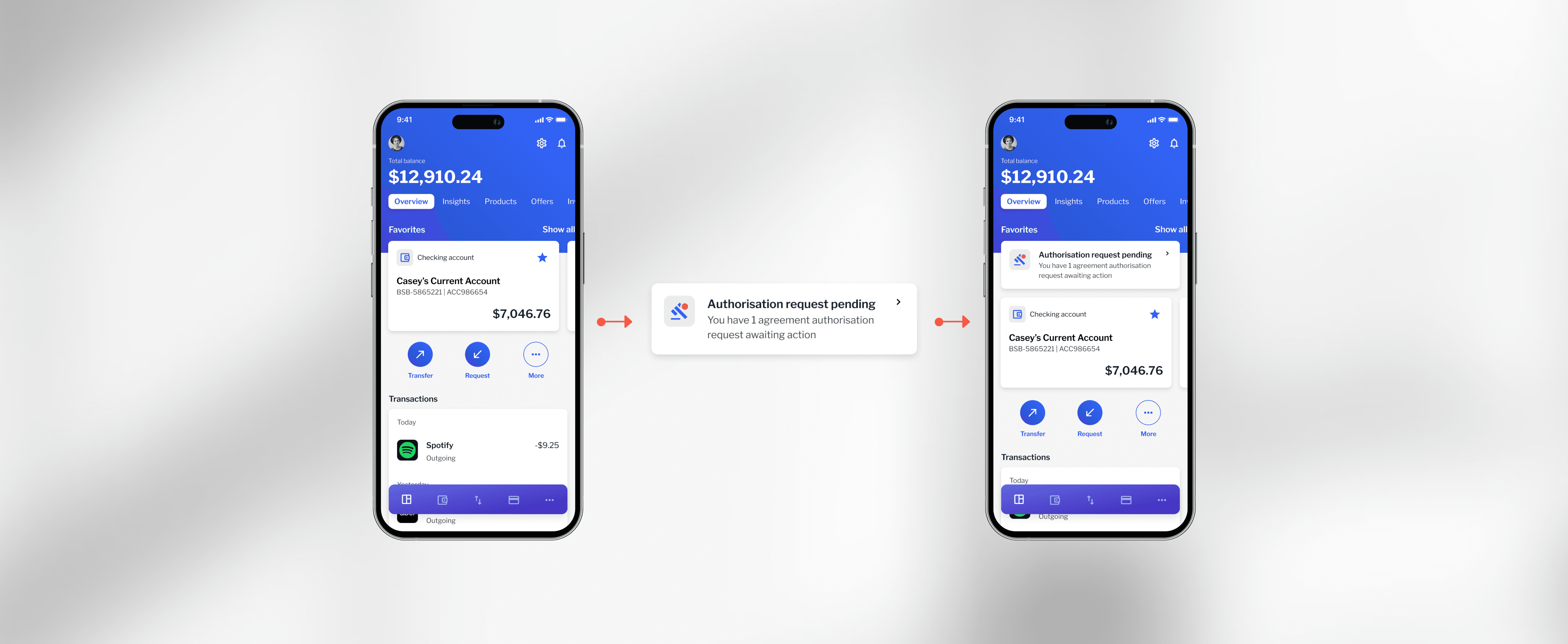
Testing revealed that users sometimes missed pending PayTo authorization requests.
To solve this, I introduced:
In-app alerts that surface important actions
Additional entry points without overwhelming the user
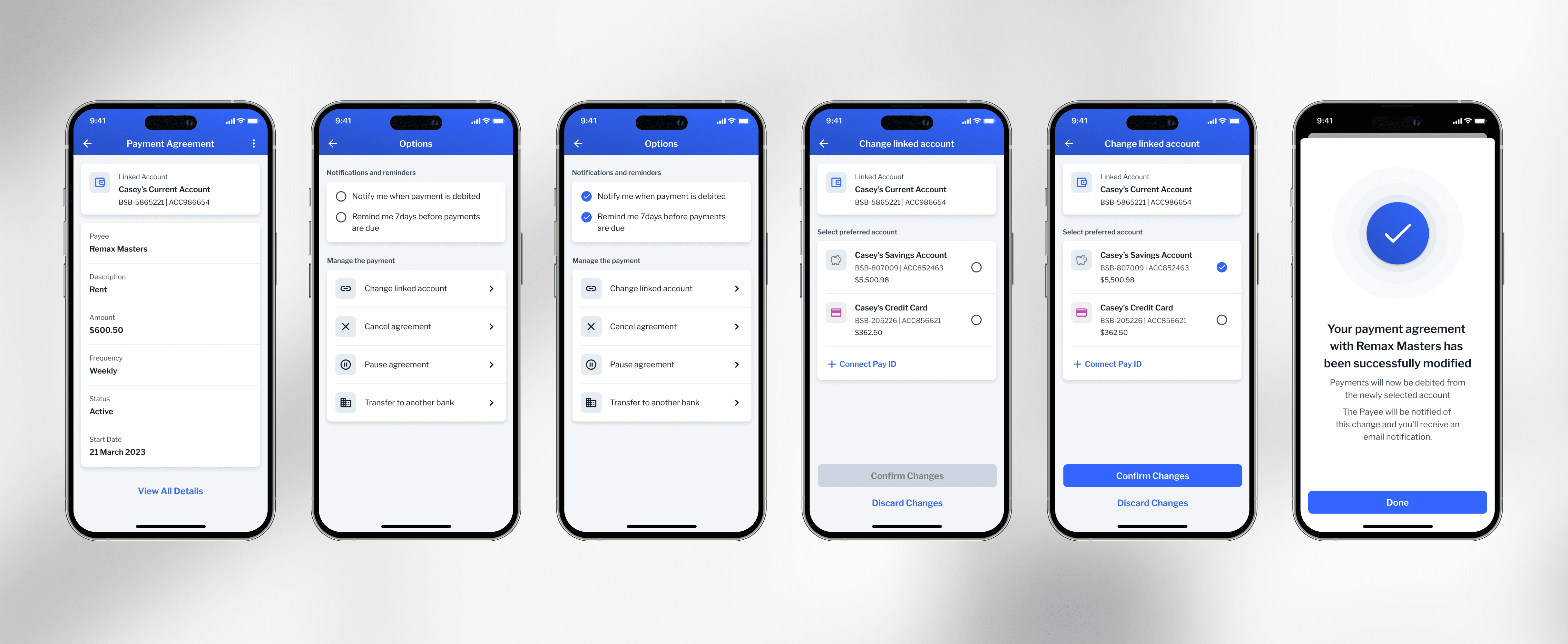
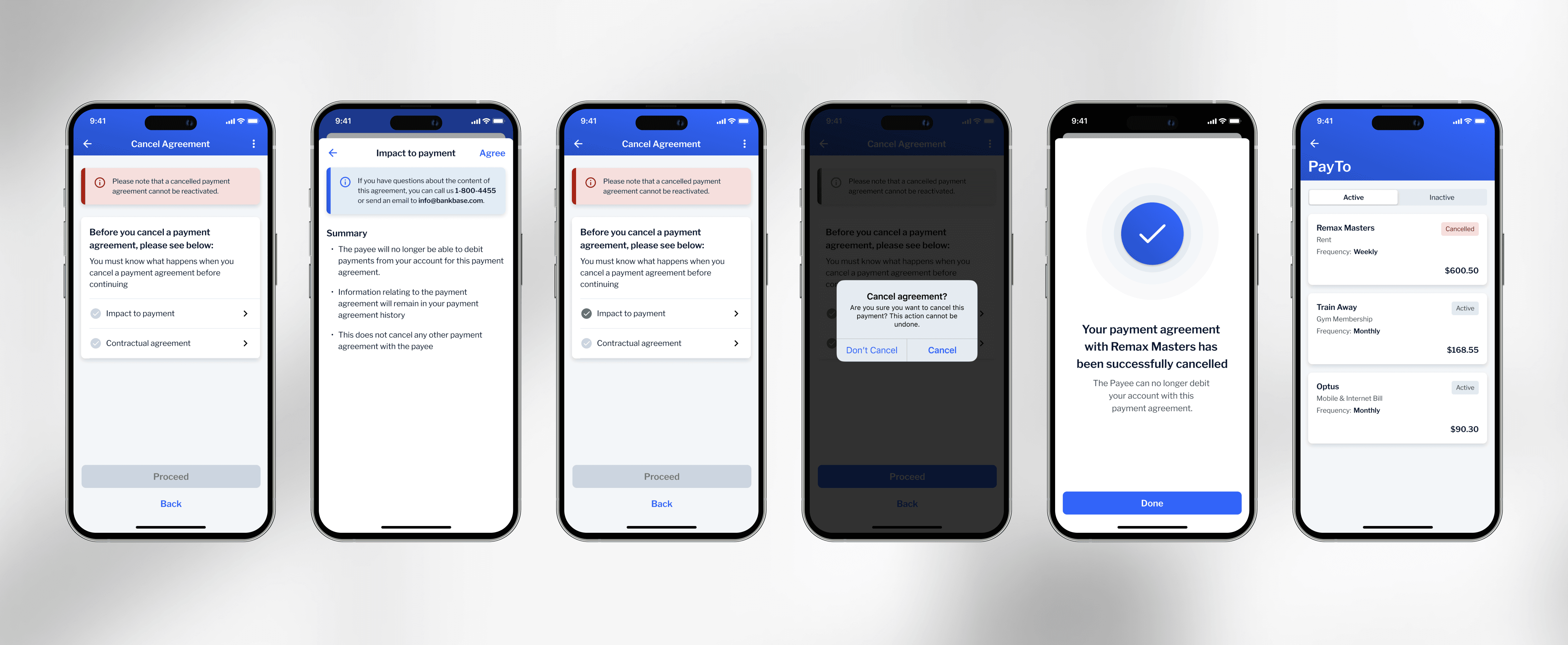
I also explored flows for modifying and canceling payment agreements, ensuring users always felt in control—even when something goes wrong.
The outcome
The final PayTo experience felt fully native to the Backbase product.
The impact:
Helped secure Backbase's first Australian enterprise client
Contributed to a contract valued at $17.7M
Received positive feedback around clarity, trust, and ease of use
Most importantly, users could confidently manage their payments without second-guessing what was happening behind the scenes.
What I learned
In fintech, clarity beats cleverness every time
Trust is built through predictable, transparent interactions
A strong design system doesn't limit creativity, it speeds up good decisions